For the first part of the assignment, you’ll work on two pages. I’m providing both the filler content and a visual language. You’ll work on HTML and CSS to make it look as close as possible to my screenshots.
Download the HTML, CSS, image, and filler content files, and work on the homepage and the page for one story.
Follow instructions in the comments of the HTML files.
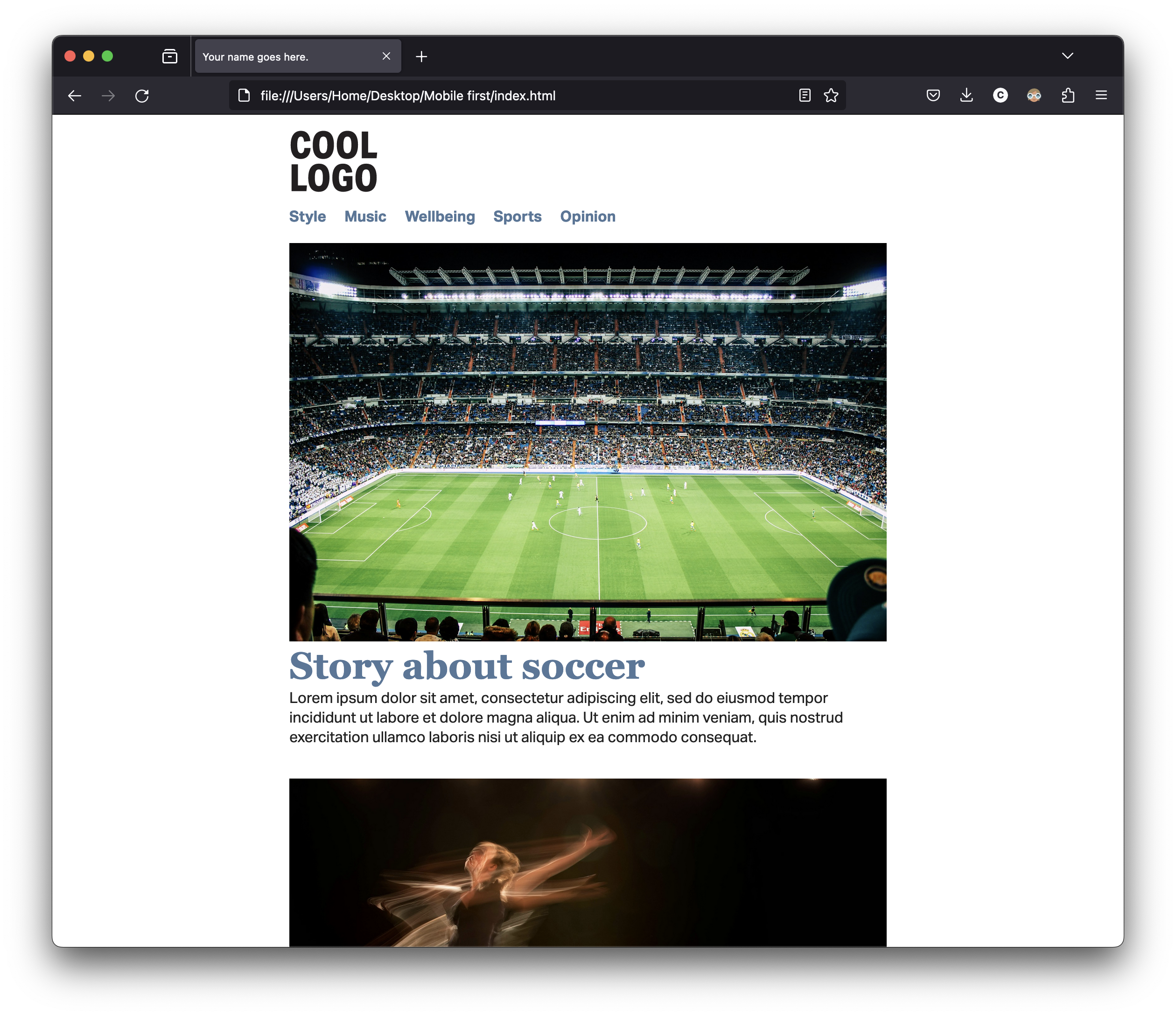
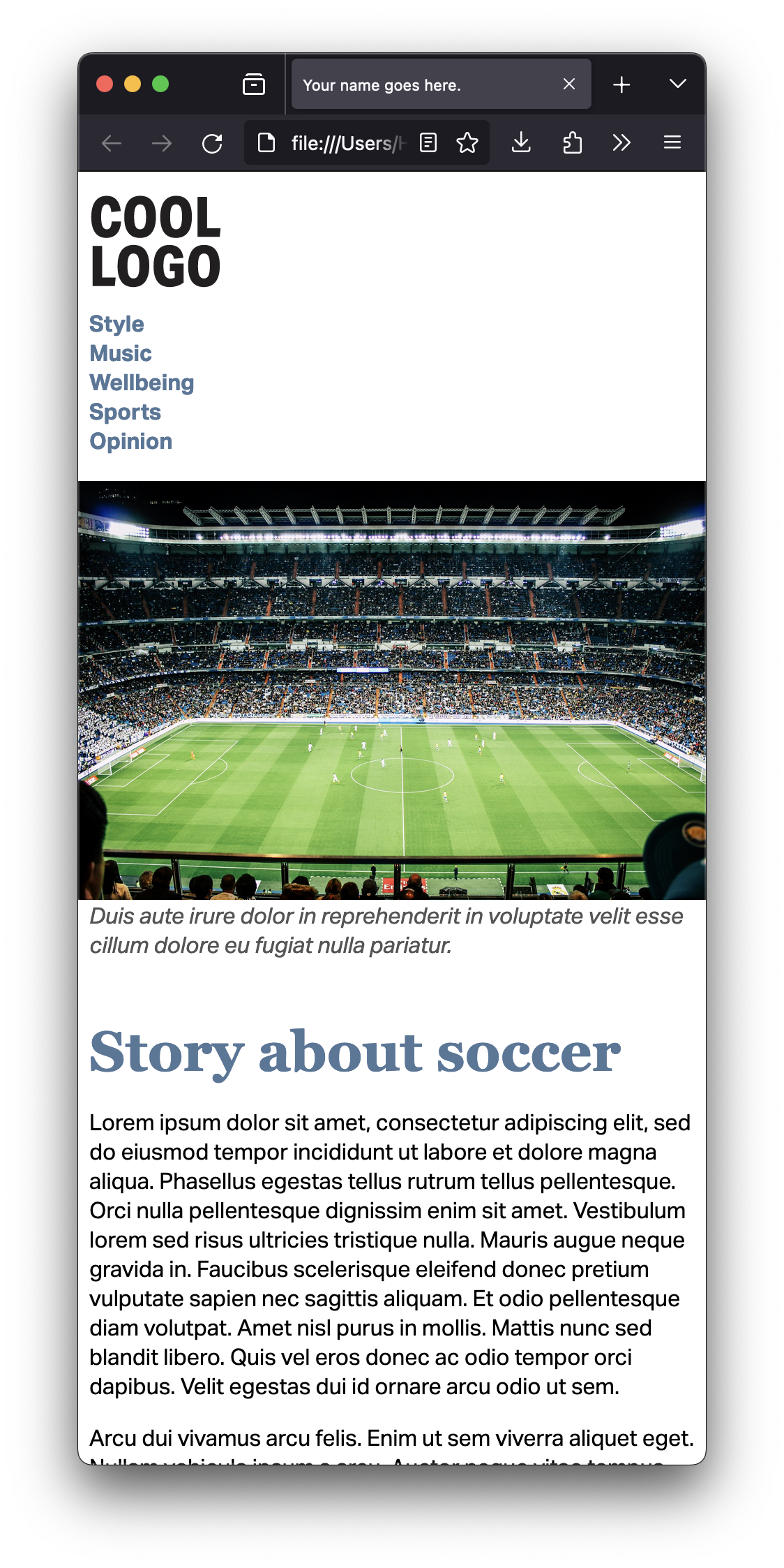
Include the header element in your HTML, with h1 and nav.
Include the SVG logo as an image inside the only h1. It’s always a link to home, of course.
Include a navigation with five sections of the publication. I hope you remember how to properly write the HTML for the navigation. But if you don’t, you can watch the video.
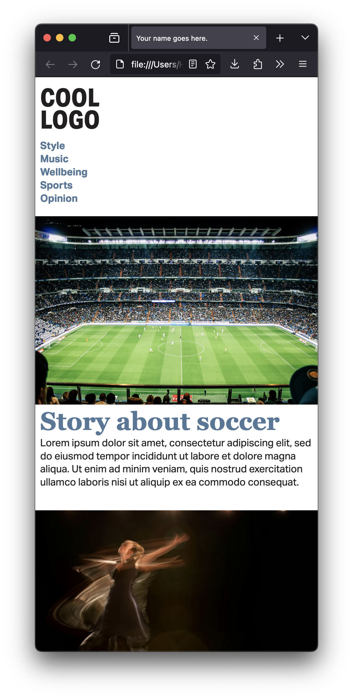
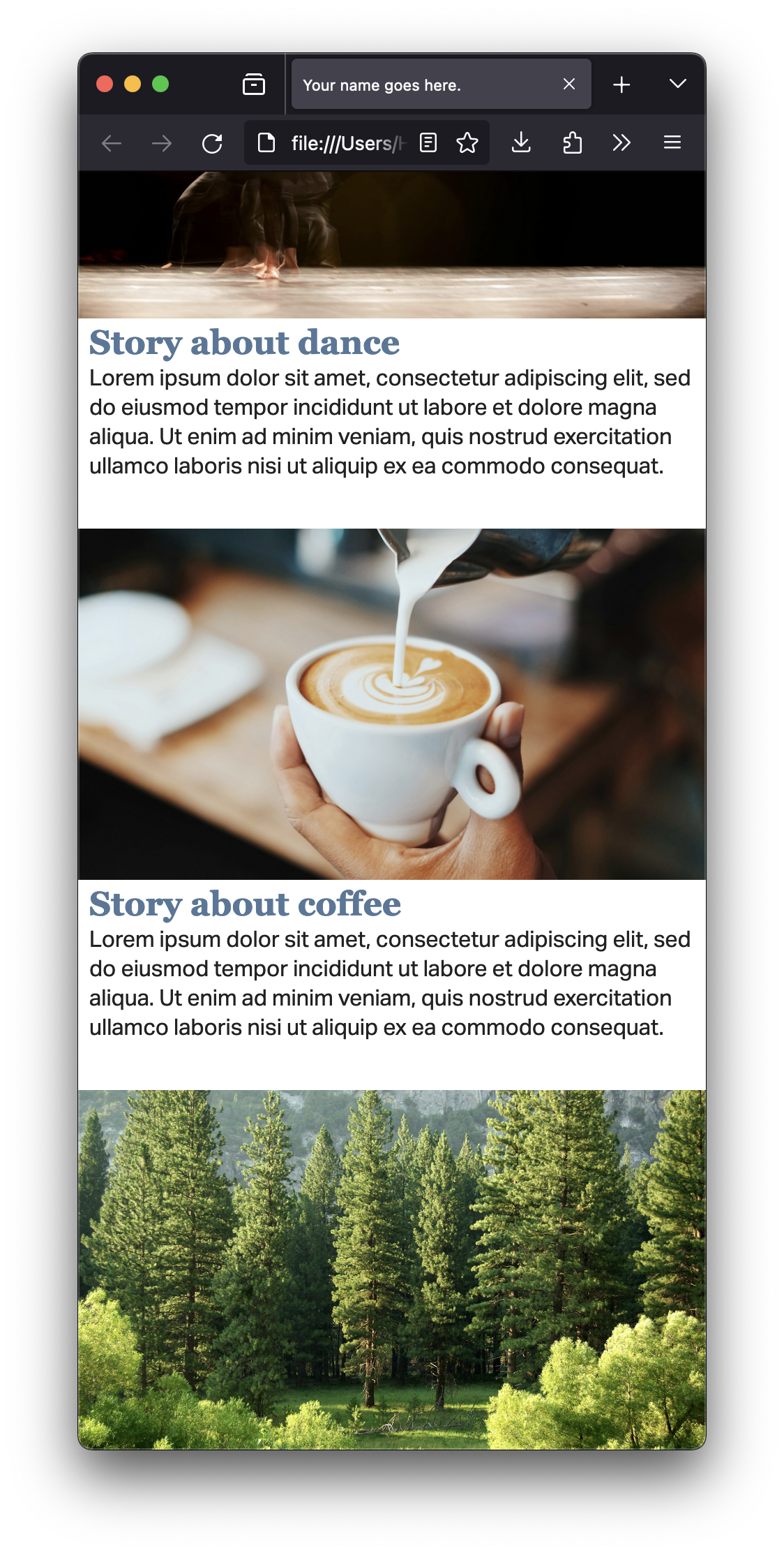
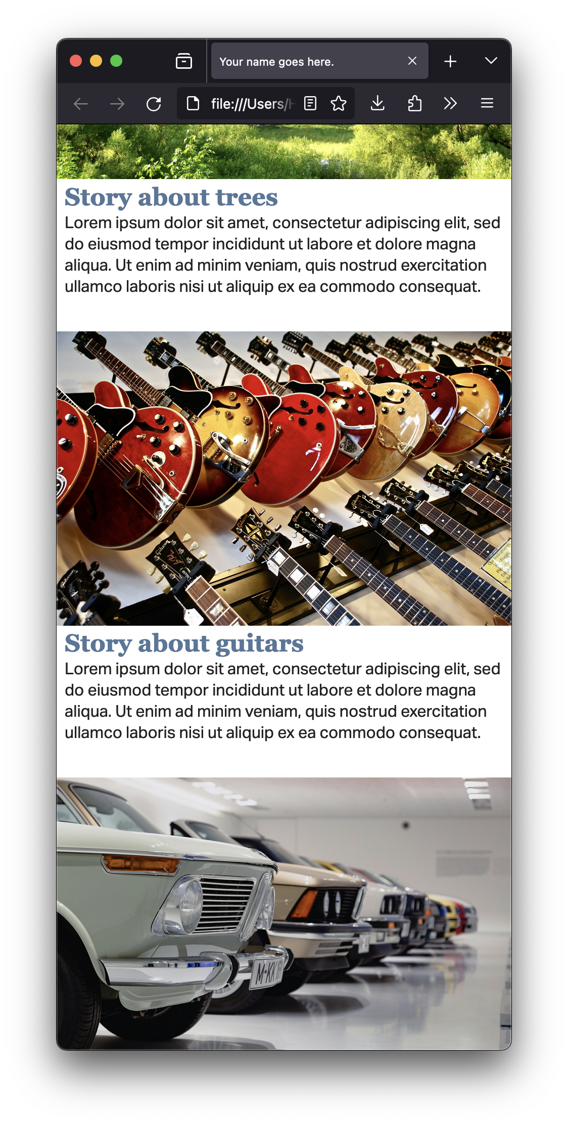
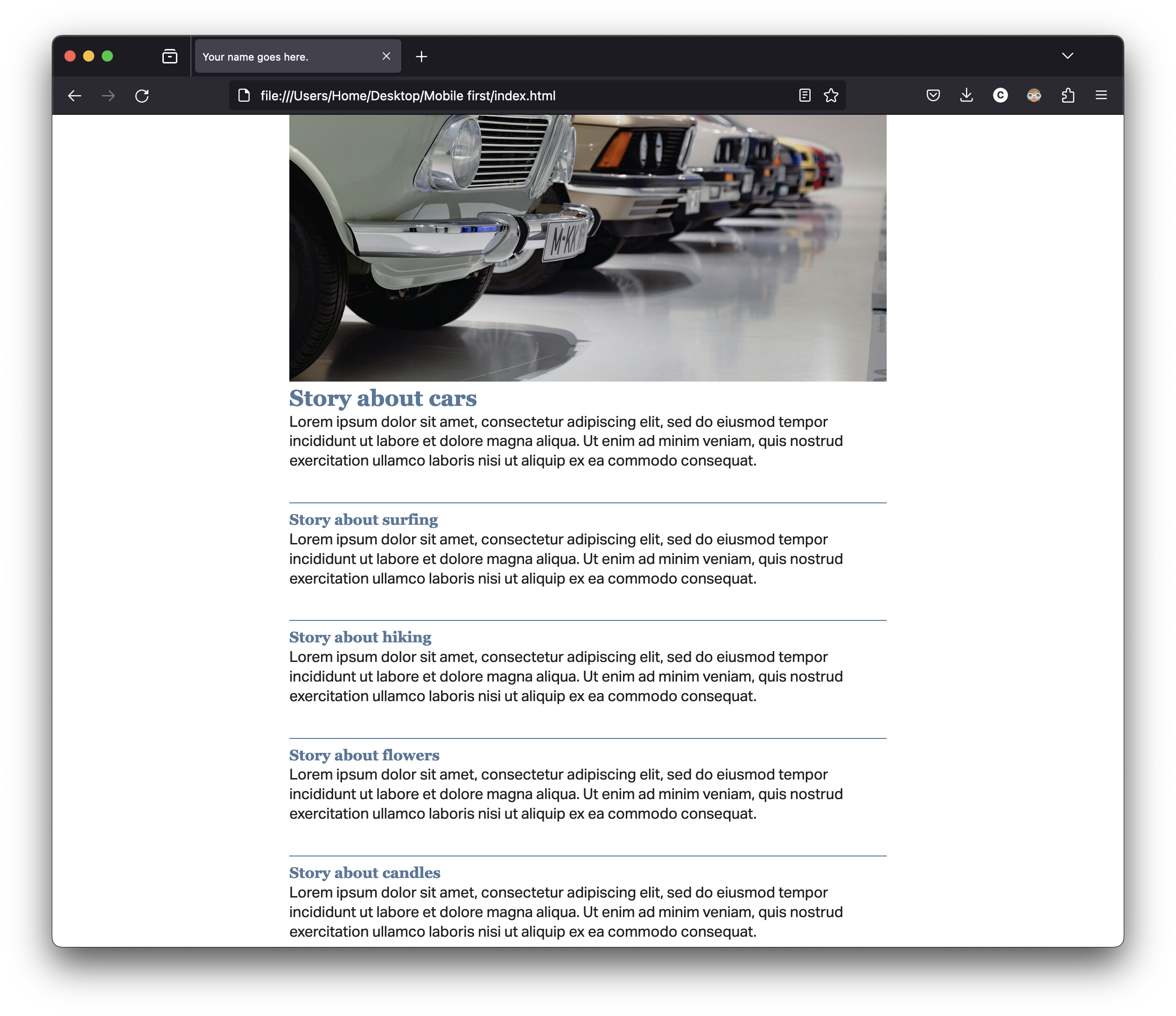
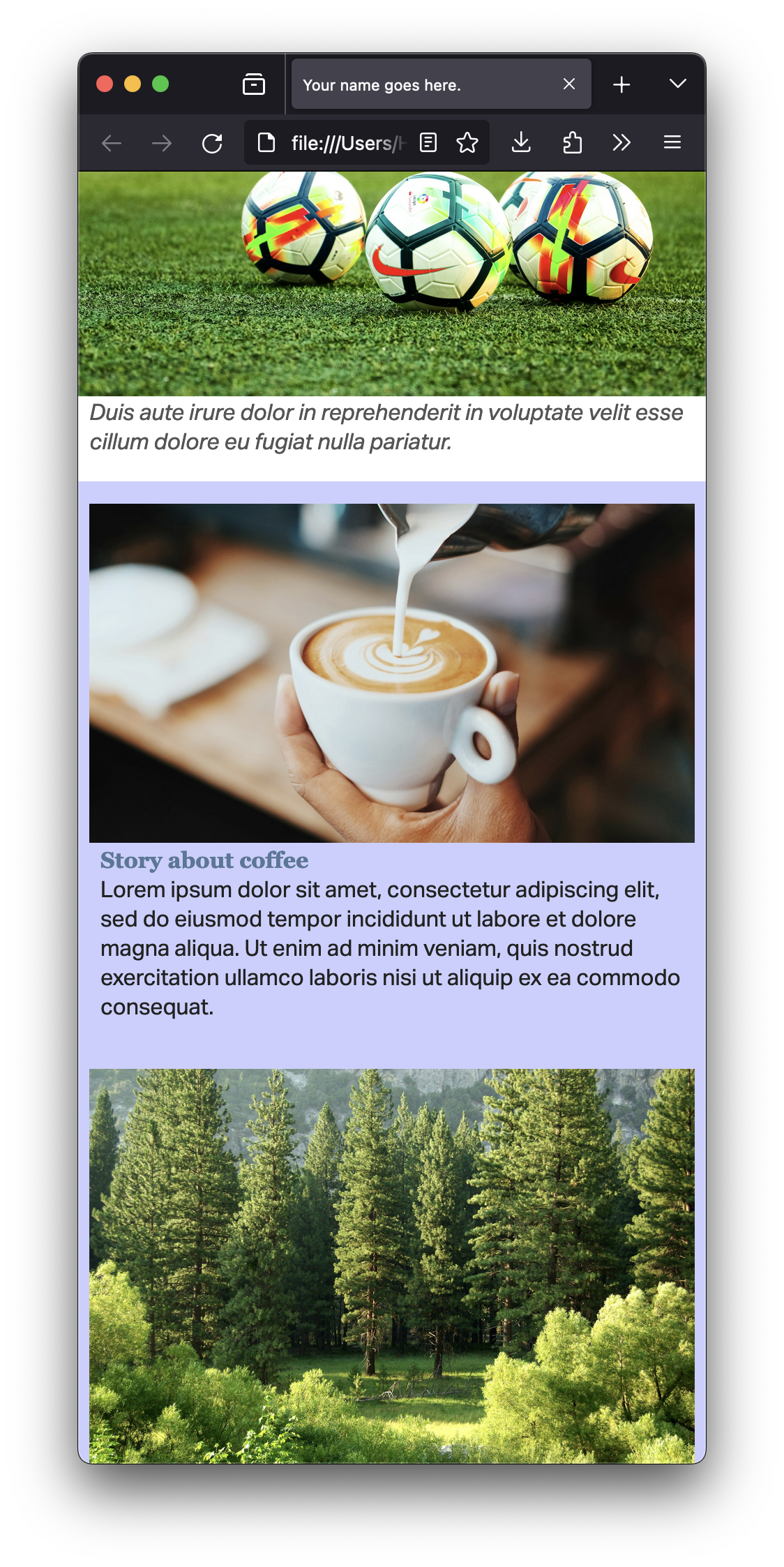
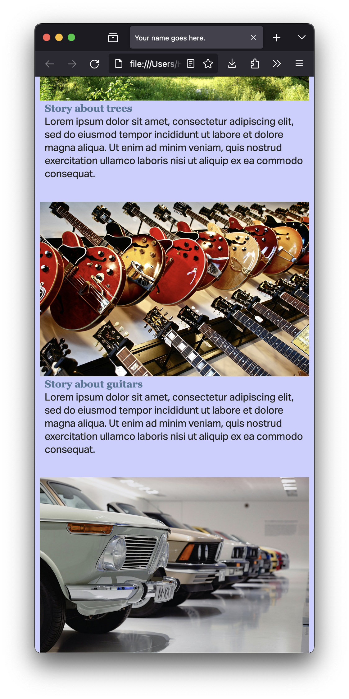
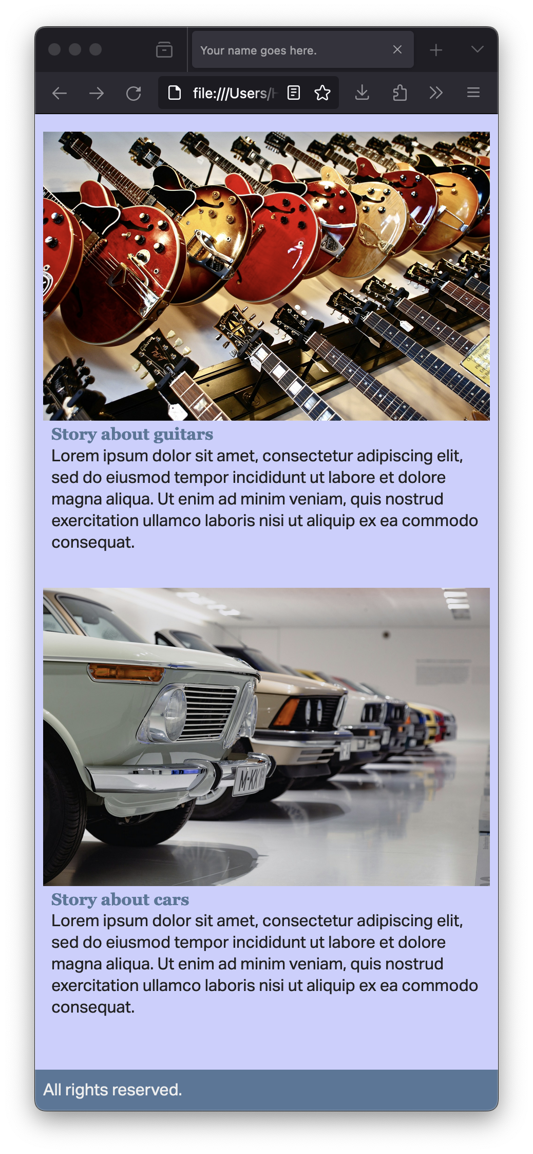
On the homepage, you want to include 12 stories, with 6 images. You may keep placeholder text for now. (Lorem ipsum.)
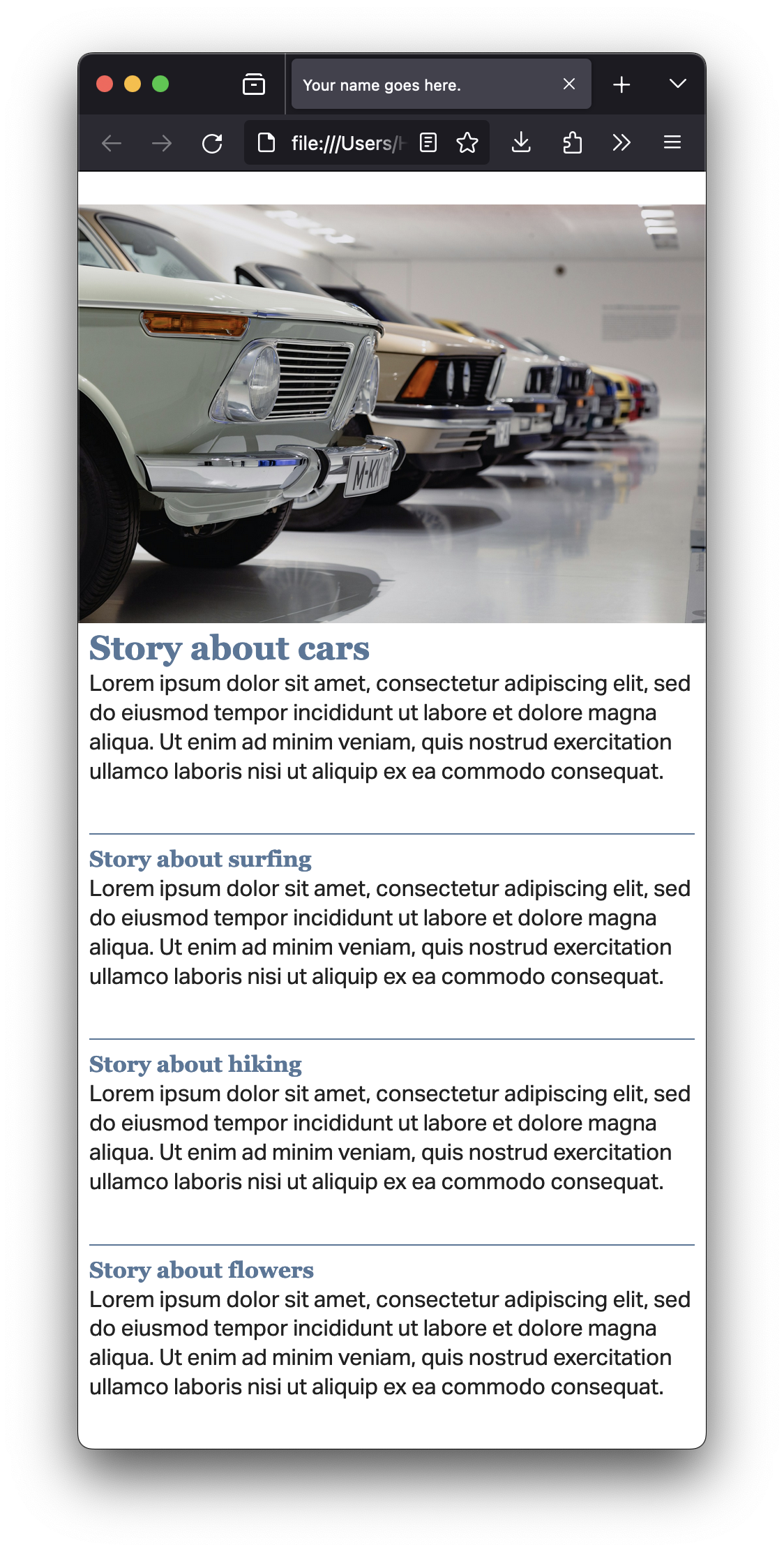
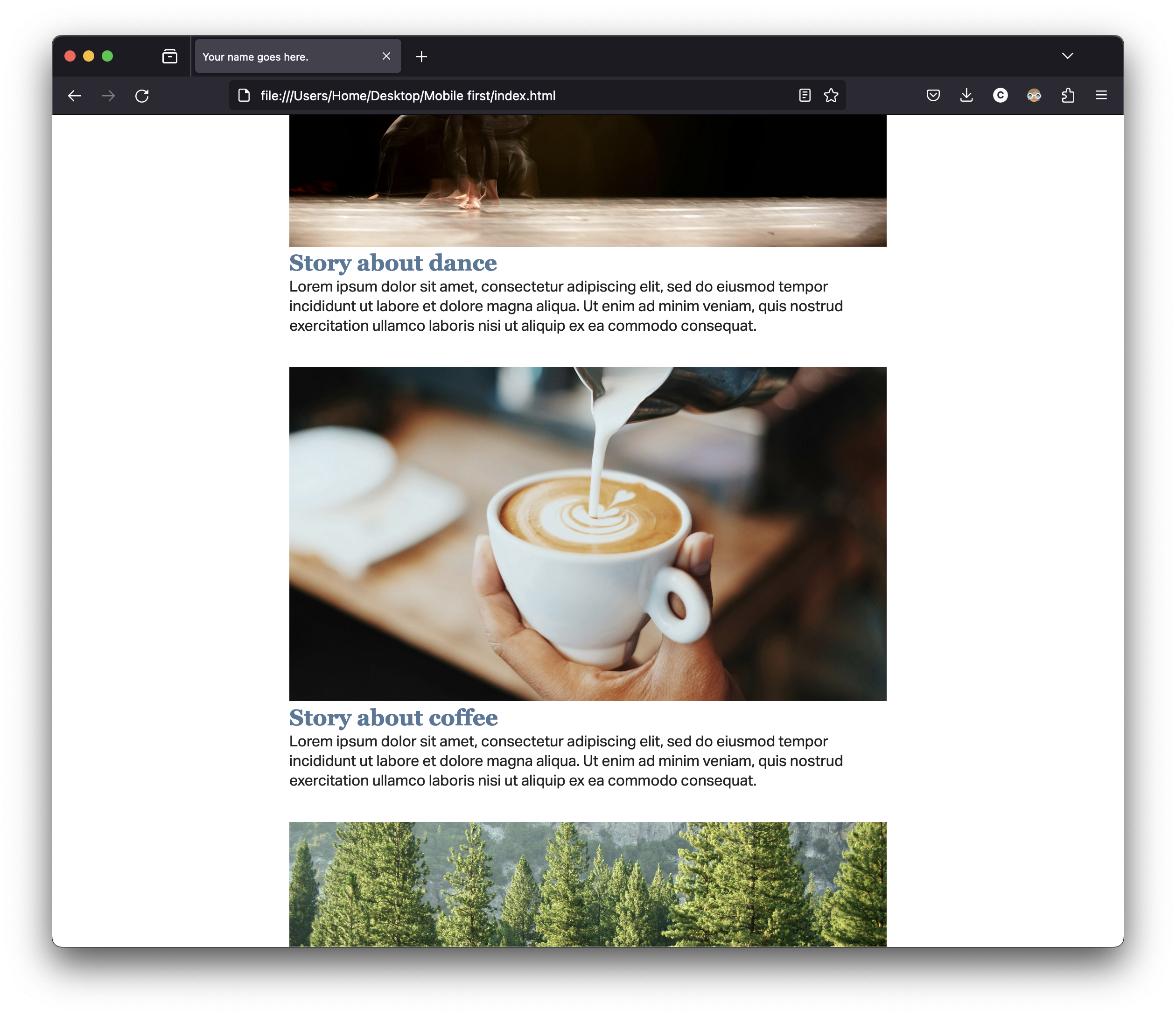
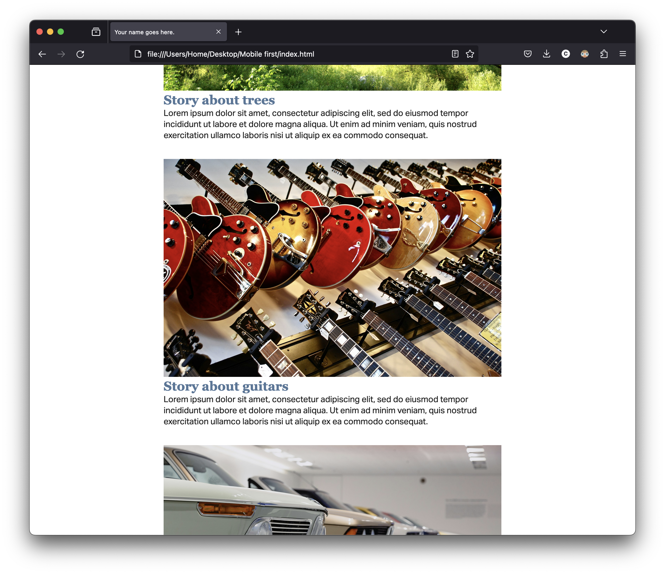
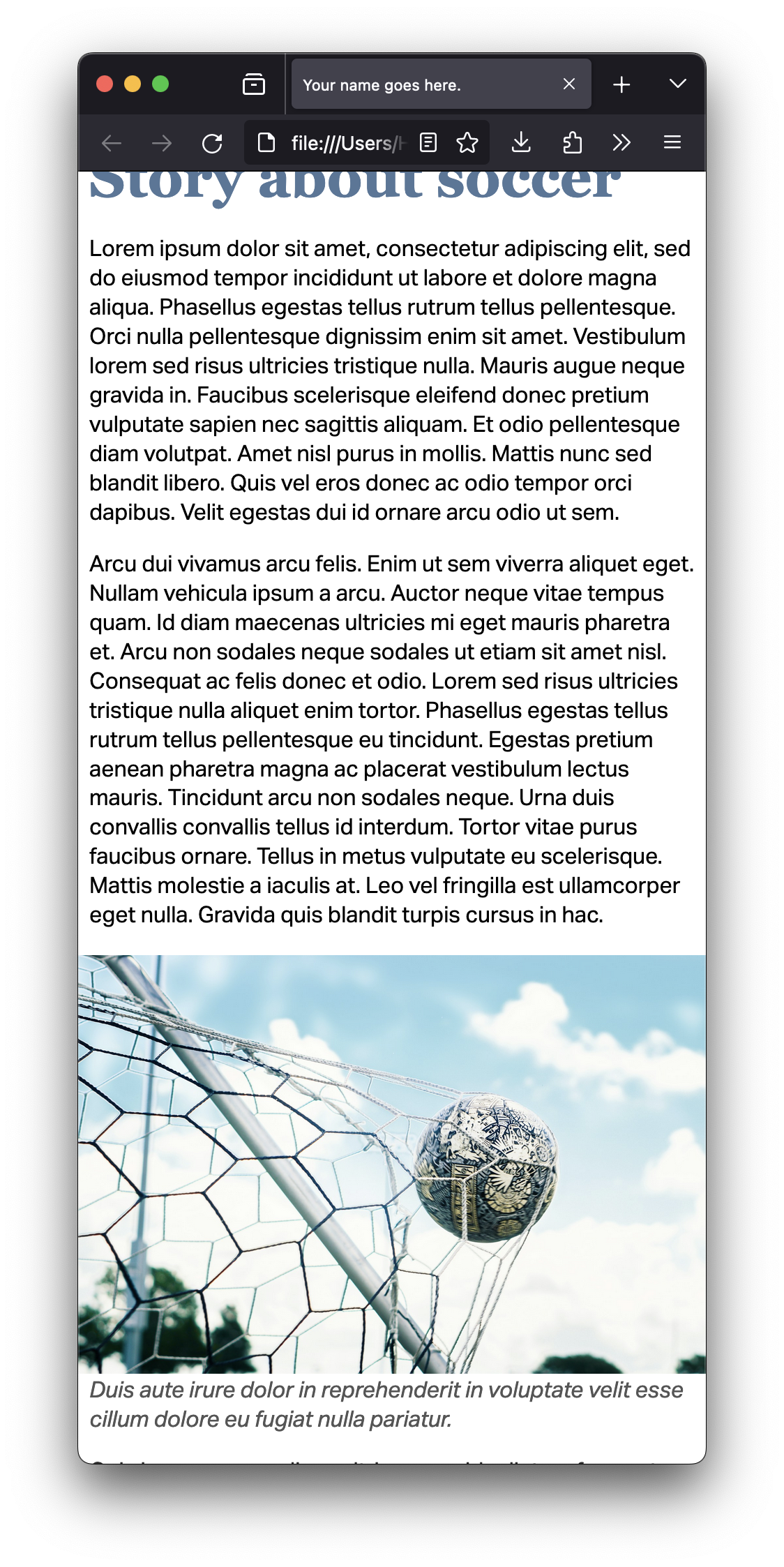
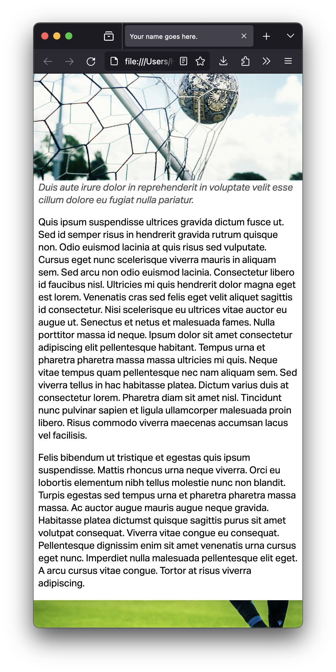
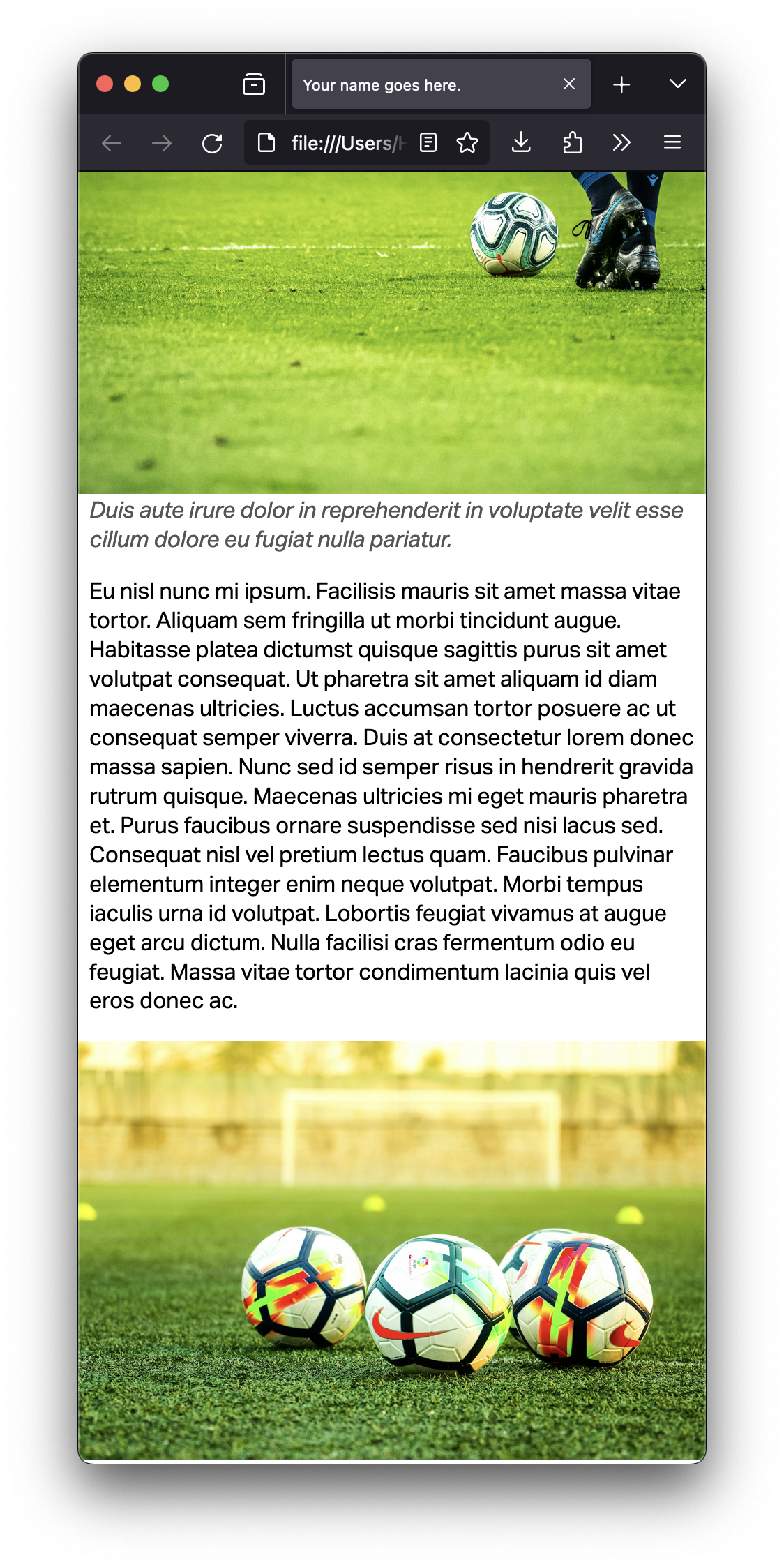
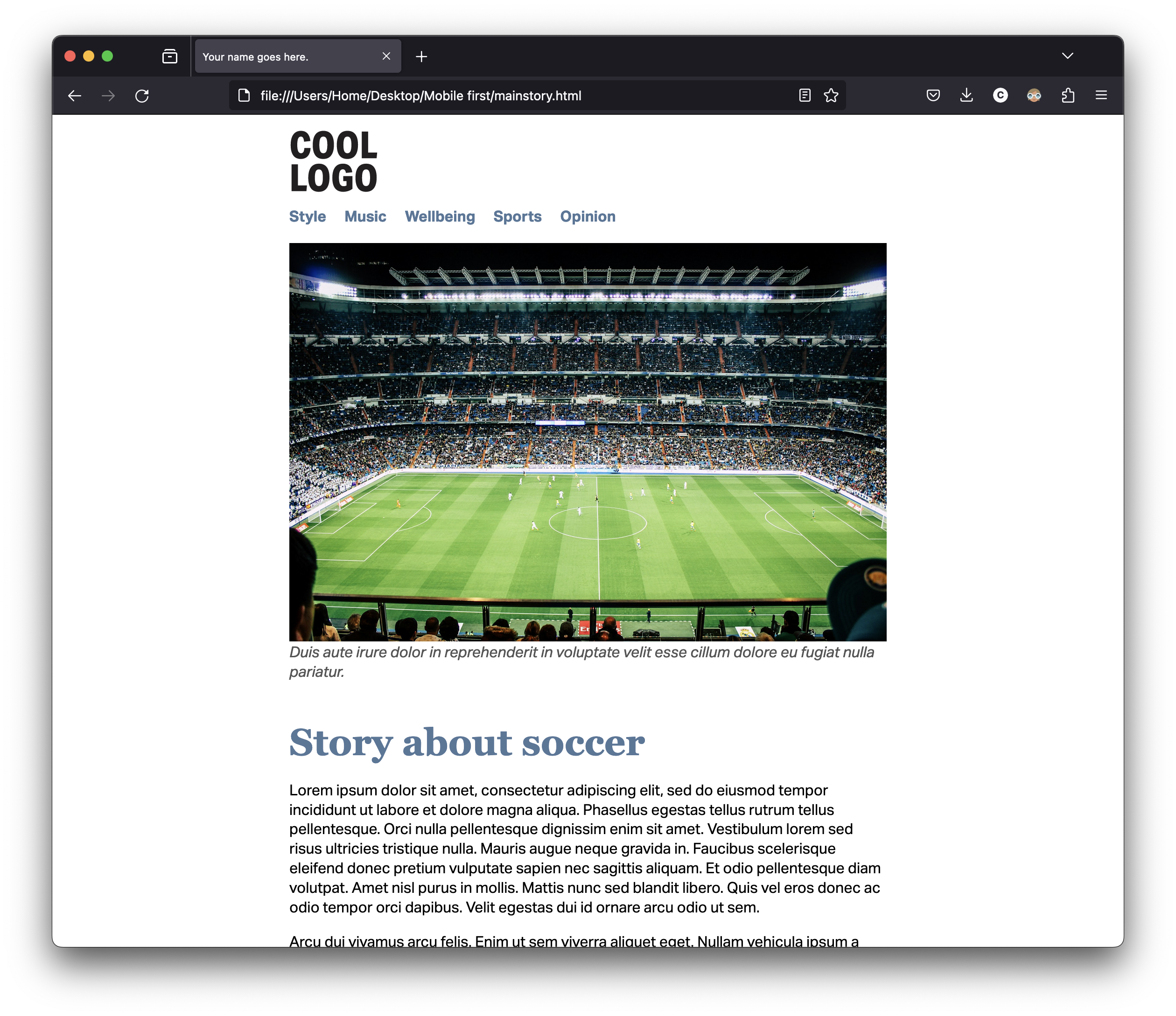
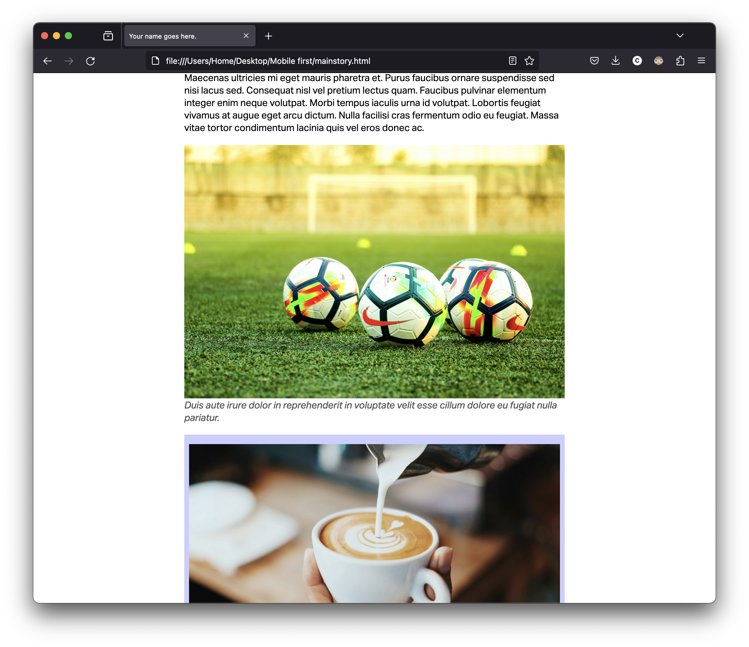
Link the main story on your home page to another page with the story. You may keep placeholder for the text, but you need three or four images on the page.
Style your website using one single CSS file, making sure it looks appropriate on a smartphone. (You don’t need to worry about other screen sizes for now; it’s for smartphone sizes only. But you want to add a max-width:XXem for your div.container.)
For now, you’ll use serif for the headings and sans-serif for the paragraphs and navigation. Don’t use other fonts for now.
Do not use any grid or flex property for now. Don’t use float either.
Two pages: a homepage and one story, with tentative final style and at least four images per page. (Placeholder text is fine for now.)
Navigation with at least four sections. (Please use proper navigation markup as you did in GRC 338.)
When you’re done, use tools such as FreeFormatter, HTML Formatter, or Code Beautify to organize your HTML and CSS code.
Only one CSS file for all the pages. (Not one for each page.)
Check the list of easy mistakes to avoid from GRC 338.
You really want to read carefully the instructions in the comments of the HTML files.
You don’t want width in percentages. (Leave the width of the img element as 100%, but you don’t want anything else in percentages. Set the width for h1 in em or rem.)
In the CSS, if you want to change the type size of all the h2 to 2em, you write:
h2 {

        font-size: 2em;

        }
But if you want to change to 3em only the h2 that are inside the section with the class mainstory, you write:
section.mainstory h2 {

        font-size: 3em;

        }
You’ll be evaluated on technical skills on the HTML and CSS files.
You don't need to submit anything to Canvas.
Go to your grc339/digital-magazine/ folder in your public repository on GitHub. ➤
Upload your HTML files (index.html and mainstory.html) to your GitHub repository. ➤
Upload your CSS file.
Don’t forget to upload your images.
Make sure to click on your name to check if it’s working.
Check Canvas for deadlines.